Centripetal Films is an independent production company that wanted a serious, modern logo that would appeal to their target market of independent-minded viewers. Centripetal means “center seeking” in Latin as their documentary projects aim for the core of a story. The brandmark I created conveys this sense of center-seeking and accurately capturing a story
Logofolio, vol. 1
Logofolio

Growpod Farms specializes in creating custom, modular, and stackable vertical farming systems using climate controlled freight container farms. I designed their brandmark in the form of a geometric leaf with a three-color scheme in order to convey growth. It is also meant to emphasize the unique stacking modularity of their systems.

This logo was a finalist in a logo competition to brand a spacecraft company that specializes in satellites and in-space service. They wanted a logo that was austere, bold, futuristic, and slightly aggressive.


This is a logo for oyster farm startup on Abrolhos Island in Australia. They wanted a simple and friendly logo that would look great on a T-shirt. I kept it very simple: an oyster symbol, and the name of the company in the same shape. Super legible and classic.
Twiice is a decision-making app that helps organize your thoughts. They needed a simple and modern logo that was friendly and professional. Adding any visual element would distract from the wordplay so I stuck to a type treatment. One “i” is italicized to illustrate movement and a person in the decision-making process: deliberation, then action.

Autome is a tech company that sells smart home products. They wanted a sophisticated, friendly, and colorful logo that emphasized simplicity of use. My brandmark design is an abstract representation of an isometric house symbol. Once I found a font and colors that complemented the mark, I had a friendly logo with a technical edge.
NOS Delivery is a UK food delivery app. They wanted a fun logo that emphasized speed and healthy food. The brandmark represents a speedometer as well as a balanced meal.
A logo that I designed for an annual technology conference that had to be virtual in 2020. OSHEAN is a Rhode Island nonprofit with an aquatic and geometric visual identity. The theme for this year’s conference was “Focus on Research” so the logo is based on the aperture of a camera, a magnifying glass and a wave. The lines along the bottom convey measurement and make the mark into a perfect circle. See the full brand here.


This biopharmaceuticals startup wanted a logo an iconic, modern, and scientific logo that involved the letter Phi (Ф). This logo is made up of every letter in the name of the company superimposed onto one another. Full visual identity here.
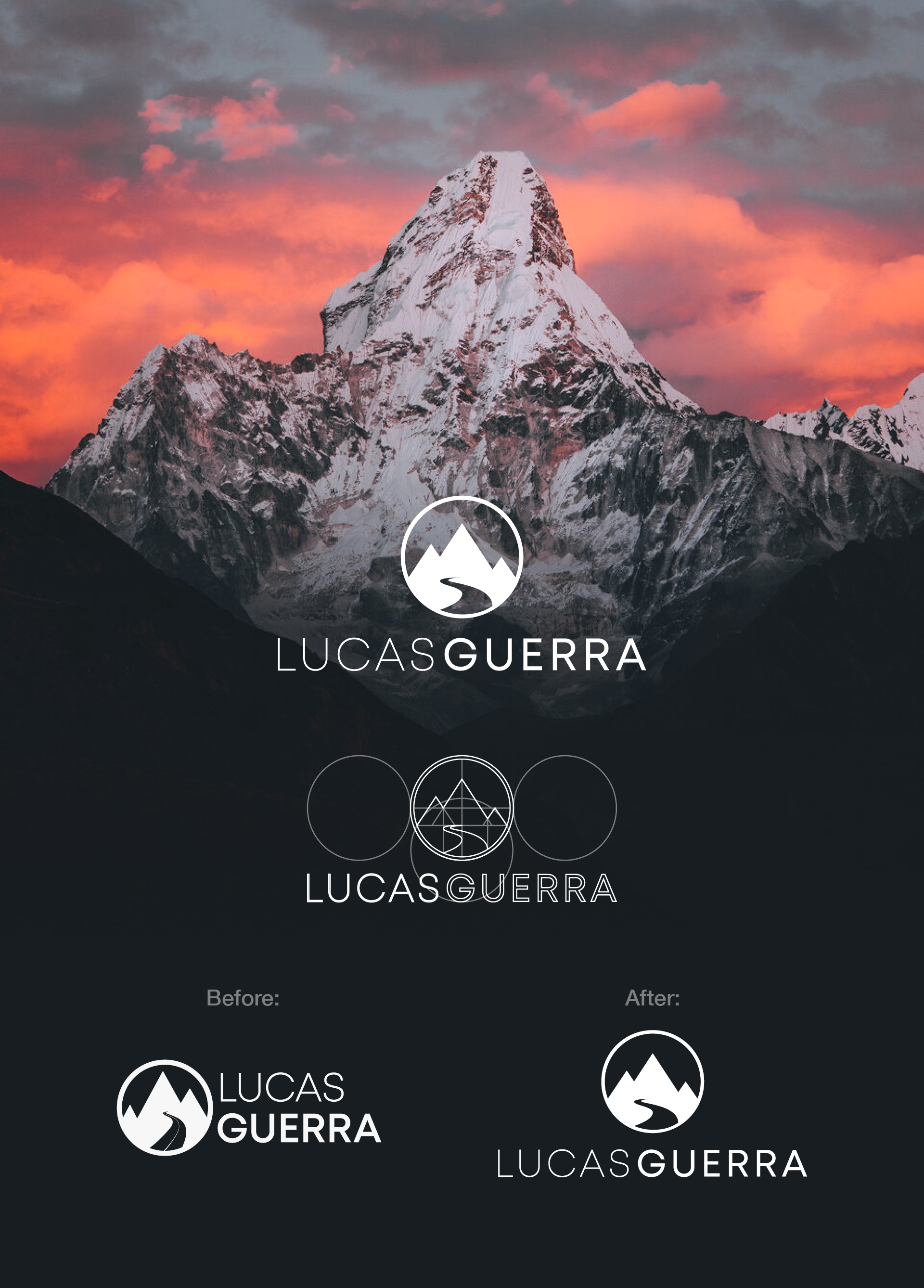
Lucas is a photographer and filmmaker who wanted his personal logo redesigned. We kept his original concept but a few subtle geometric adjustments really elevated the idea.

